Thursday, April 28, 2011

another baby, another nursery...

I recently found out that two of my very best friends are going to be mommies- or is it mommys- they both look wrong, to me. Anyway, true to form, I haven't been able to think of anything but nursery designing, dreaming, and decorating. Since they are both having sweet baby girls, I have been extra excited thinking pink for a change! I found the coolest inspiration at houzz.com (awesome site btw) and pulled the colors out. It's basically just the primaries- so typical of me- I love the contrast of bright, bold colors...


I tried to capture the modern and inviting feel of the inspiration piece but with less of the clutter. The geometric wallpaper and and modern crib contrast with the eames chair and traditional dresser and bedding giving the space an ecclectic aire. The feminine chandelier and pretty vases balance the bright red striped rug and the pops of humor found in the accessories and art. I love this nursery. It's the type of place that I would want to live- and it would definitely grow up wth her!

Then I also created a more calming styleboard using the same color scheme. I added warmth to the walls and found a rug and chair with softer tones. I only used small pops of bright color.

Tuesday, November 9, 2010

Sharp Dressed Man

A rainy day requires a project- and the last one for me was dedicated to some cute onesies that I already had on hand. I have often seen a version of the tie onesie around so I thought as long as I was gonna make my little boy look like a man, I might as well make him look like a smart man, too! (Which I am sure he will be!) I really like the way the tie turned out- but those glasses?? How fun will that be?!

Monday, November 8, 2010

Commissioned Paintings

These were so much fun to paint for my friend's son's big boy room. She said that he loves "bobots" right now- I hope he loves these!

Thursday, October 28, 2010

Balloon Mobile

Working on our nursery for our soon to be baby boy has been fun, exhausting, and expensive! But when it came to a mobile- I knew that I could create something that would fit right in with our style and our budget. (This cost me under $15!) My inspiration: The Flensted Balloon Mobile
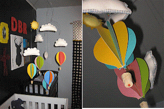
Mine is a little different though... I love the simplicity of the Flensted mobile and I really love working with cut paper but I wanted to soften mine up with some white felt clouds and a bright sun floating above everything. Here's how I did it...

A roll of thick wire and a few different sizes of pliers was all I needed to start. This was a difficult process and even harder to photograph! I started with the first few wires that would be the main part of the mobile and, as soon as I could, I hung it from my dining room chandelier so I could see how the mobile was balancing. After I finished the wire I felt like I had a little more confidence in myself and the process became easier and more fun as I continued.

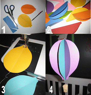
The ballons were actually very simple! 1.) Using double sided card stock, (actually note cards that I already had) I cut out the shape of my balloons. Each balloon needed 4 pieces of paper. 2.)I folded them each in half and then 3.) stacked four pieces together and sewed a straight line up the center. 4.) Lastly, I carefully "opened" up the ballon to show all the colors and, using clear fishing line, attached a cork and a bead underneath for the basket.

I think the mobile would have been adorable if I had stopped here... but I just can't pass up an opportunity to use a blacket stich on some fuzzy wool felt! So I cut out some clouds and a sun- stiched and stuffed them and hung them from the wire. Finally I hung the ballons below the clouds and the mobile was complete! I love the finished product!


Friday, May 14, 2010

Not to make this blog all about babies... but my husband and I are going to have our own little bean in about 25 weeks. It is so exciting! (and unbelievable, and terrifying...) We have so much to learn and so much to do! Of course, I immediately began putting together the inspiration for our new nursery. We don't know what we're having yet- so until then, to be on the safe side, I made one for each! If we have a Little Mr.... I love these colors- no definite color scheme, just big, bright, and bold! Funky patterns with clean modern furniture that will give the room a sharp but still silly feel.


Now for a little girl... a very different feel. Still tons of color, but with a more eclectic touch. I love the idea of fleshy pink walls with some antique inspired accessories and again, graphic patterns are introduced through the fabrics. I want this room to feel cozy and feminine without the frilliness.


I think a rocking chair and a soft rug are musts for any nursery. Also, a fun light fixture will make this space feel special. Now, we must be patient until we can find out what our little bean is. But the real challenge is to use these boards as inspiration only and restrain myself from just purchasing all these items and spending a small fortune on this room and not saving money for those other necessities... like diapers and car seats and that kinda stuff!


Friday, April 23, 2010

Reminiscing...

As we begin the next venture of home improvement, I am reminded of how far we have come. When we first bought our home it was, shall we say, less than appealing. Even in the midst of our sheer joy and excitment of purchasing our fist home together- the thought of making this house livable was exhausting! Thank God for the help and support from our family and friends! It was a ton of work!


To say the curb appeal has drastically improved would be an understatement! It's hard to see through the screen, excess of limb dibris, and thorn bushes gaurding the house, but the brick was a bright red and all the trim white. It was a scary descision, but the taupe base color was the perfect choice for us. My husband chose the red windows trimed in a dark gray- I was skeptical- but I love it, now! The landscaping (also my husband's doing!) is beautiful! Every season we have new color. This spring we had tulips. Now they're gone but the azaela's are bright pink!
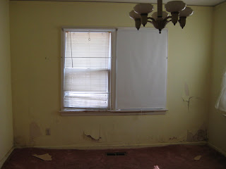
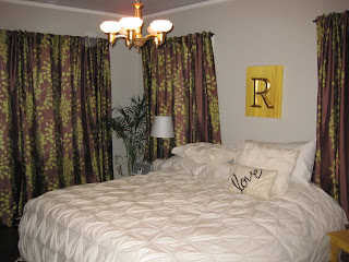


Layers of wallpaper, paint, and more wallpaper had to be hand scraped from every wall, ceiling, woodwork, and door throughout the house. This is currently our master bedroom- some of these walls had to be replaced with drywall once we got down to the plaster and found tons of scary mold growing everywhere! But check out the original light fixture. It was a pale yellow but I repainted it with gold leaf and it is beautiful now and still looks authentic!


Ohhh... the carpet. How could I forget? While we naivly assumed that this would be a simple task, we had no idea that the carpet pad, which had been in the hosue for 40 years, had turned to a waxy, clay-like, adheasive and also had to be handscraped from our wood floors. I can't believe we were able to salvage the floors at all! But again, my miracle working husband, (with the help of my dad) refinsihed the floors to all their glory with a dark chocolate stain. Gorgeous! And I love the way this room turned out. Althoughn its hardly ever been eaten in, we do walk through it all the time and its the perfect place to fold laundry, pay bills, and leave my purse and junk mail. So see- we use ours all the time!

So, here is a quick peek at the kitchen before the big kitchen renovation begins tomorrow... Granted... we did put a quick coat of white paint over every inch of the glowing robbin's egg blue color and, of course, we had to purchase a few appliances that worked... but this is basically the kitchen that we have been using for the past two years. YIKES! I cannot wait to get our new one!!


Tuesday, March 16, 2010

One of my best friends is having a baby and refuses to find out if she will be expecting a little man or a sweet little baby girl. Being the honorary (decorating obsessed) aunt that I am, it is my duty to help create the perfect gender-neutral space for this precious baby to come home to. I have a few ideas... Remember- a baby's room is really just for mom and dad the first few months and then it will ultimately become filled with toys, books, and that raggedy stuffed animal that you can't pry from your sweet baby's fingers, none of which will match the decor anyway. So... my idea? Don't choose a specific color scheme. Choose a neutral base color then add pops of color in the fabrics, furniture, and art. The room will look like a nursery- so why not attempt a contemporary, sophisticated look that will be calming for you and your baby.

I love how pattern and color is brought in through the furniture and wall decals can be great for temporary color and especially for those who don't feel comfortable with a paintbrush.


Most don't see navy as a neutral- but think of it like denim- it goes with everything! I know painting a wall this dark can be daunting, but with the adjacent white walls and bright pops of color, I think it is an awesome look!


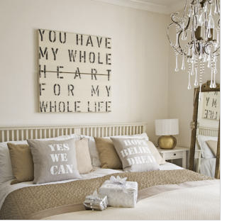
Obviously not a nursery, but it could be! I love the calming neutral bedding, the light walls, the chandelier and the mirror. Also, how cool would this art look above a crib... I can't think of anything more fitting.

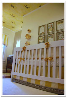
Yellow can be a neutral! I like how, in this room, the yellow is a rich gold- nurseries don't have to be pastel. In this case, the color is actually a wallpaper that has been applied to the ceiling instead of the walls.

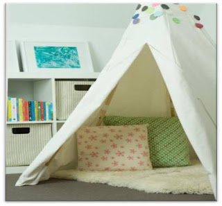
Now, this is my favorite idea... a tee pee in a baby's room? Naturally this is something they'd have to grow into... but it looks so whimsical and modern! And can you say most fun sleepover ever!?

Friday, March 12, 2010

friday redesign: bachelor pad

My brother recently bought a house and has been gradually renovating it room by room. His newest venture is the entry way which is an addition built by the previous owner like 40 years ago on what was originally the font porch. It is a big space that opens to the kitchen and the living room and happens to be the first thing you see when you open the front door.


My advice: bring in some color and some humor! Right now it is a dark and dull space with no personality. I like the horizontal real wood paneling. It is a great base for a contemporary, masculine style.

Start with the floor- a large, graphic, black and white cow hide will add warmth and a visual pop as opposed to the small neutral one there now. I would rearrange your chairs to sit in the corner and place a comfy, rattan pouf in front that would be both functional and stylish. (I should probably avoid using the word "pouf" when trying to convince my older brother of anything- lets just call it an ottoman instead. ) I also love this modern, arc floor lamp and the twig coat rack that plays up the "woodsy" feel of the space. Finally, find, or, better yet make, an over sized art piece, like this pixilated Abe, to hang on the blank wall and get some colorful throw pillows for the chairs.
All in all, this project would be at least $600 and I didn't even address the windows. But, if you change out the rug and pillows for some from Target or find a cool coat rack from a thrift store and spray paint it an unexpected color, you could easily shave off a couple hundred and still make an awesome first impression, especially for any bachelorettes that may stop by!

Wednesday, March 10, 2010

save the date!


Wedding season is fast approaching! I love weddings! What's better than a big party filled with tons of people you love celebrating the fact that you're in love? (Also, the awesome finger foods and champagne- they're nice too!) My cousin is getting married this summer and I started gathering ideas for the big day about 24 hours after she said yes. (Maybe more like an hour and a half but who's counting...) Lets be real, the "big day" is a culmination of a lot of smaller days spent planning, taking pictures, sending invites, tasting cakes, ordering flowers, trying on dresses, laughing, crying and most definitely, stressing. Some stress is unavoidable- but most of it relates to money one way or another. Working on a budget is my specialty! I helped her create on awesome background for their unique Save the Date Postcards and I think they turned out awesome. Cost? 1 piece of plywood, wood trim for a frame, chalkboard paint, white chalk and creativity... about $40. Love at first sight.

why marble?

My husband and I are finally redoing our kitchen and have decided to use carrara marble for most of our counter tops. I think it is beautiful and classic. Although it has been popular for decades, the way it is used today it is not only current, but in my opinion, unique in a world of ubatuba granite everywhere I turn. Marble looks great with its classic glossy surface but can also be honed for a more subtle (but still beautiful) look. Honing can also help disquise thiny imperfections or even scratches on the surface. It can be paired with other materials like a soapstone or even concrete on neighboring countertops. The main arguement against marble? It tends to be a little more finicky than other stones. But I love what a woman from our stone supplier said to me recently, "If the streets of Italy have been paved with Marble for 100's of years, surely it is strong enough to withstand my family." It scratches and stains easier than granite or quartz due to its porous nature but it is equially as hygenic and can make a statement like no other. How beautiful is the kitchen above from Downsview Kitchens? The marble adds an enormous amount of light to the room paired with the dark stain and the white cabinetry. Not to mention the stainless steel touches, the industrial style lighting, the wall of pantry, state of the art appliances... (sigh)...here's to dreaming...

Tuesday, March 9, 2010

the house with a yellow door

I think the color of a front door says a lot about a person. Are you a traditionalist who paints their front door a patriotic red? Do you tend to be more subdued and paint your door a soft gray that doesn't make a loud statement or compete with the landscape or shutters? Or are you a risk taker? Do you do the unexpected and paint your door a rich violet or even a shocking blue? I don't know exactly what kind of person it makes me, but I know I have always wanted a house with a yellow door. I think it all stemmed from dreams of throwing a big party and inviting everyone I know. And, when giving directions, I could simply say, "Mine will be the house with a yellow door." There is no denying a yellow door. It makes a statement. It is fun and optimistic. Maybe that's the kind of person I want to be. Think of how lovely it would look with a great big red berry wreath hanging on it in the wintertime or a deep purple lavender wreath in the spring? Yes, someday I will have the house with a yellow door but until then, I will dream.